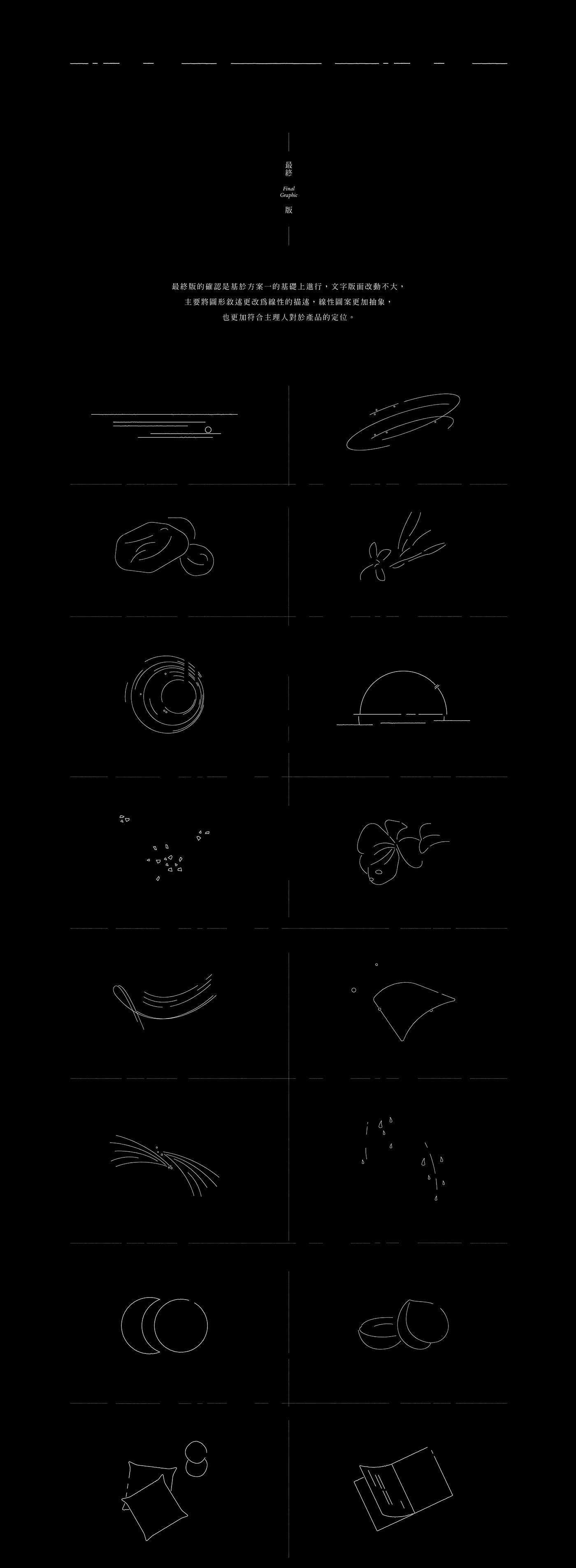
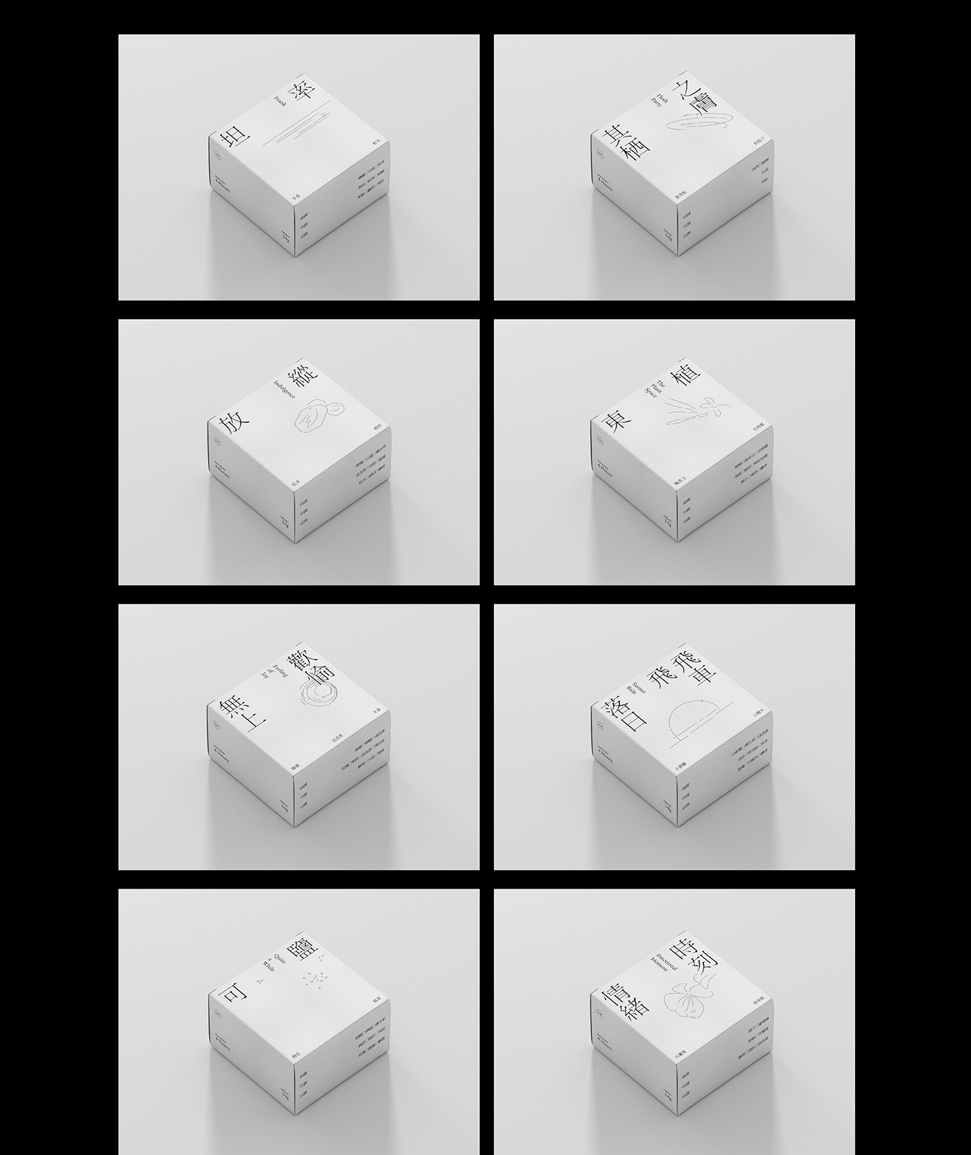
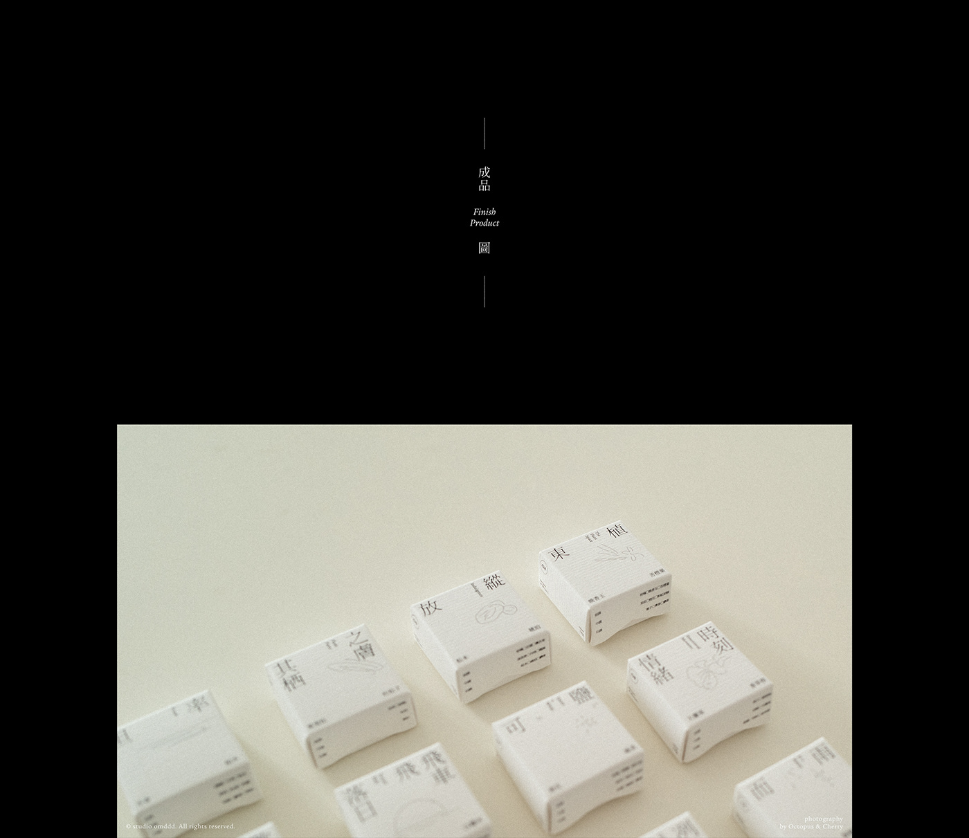
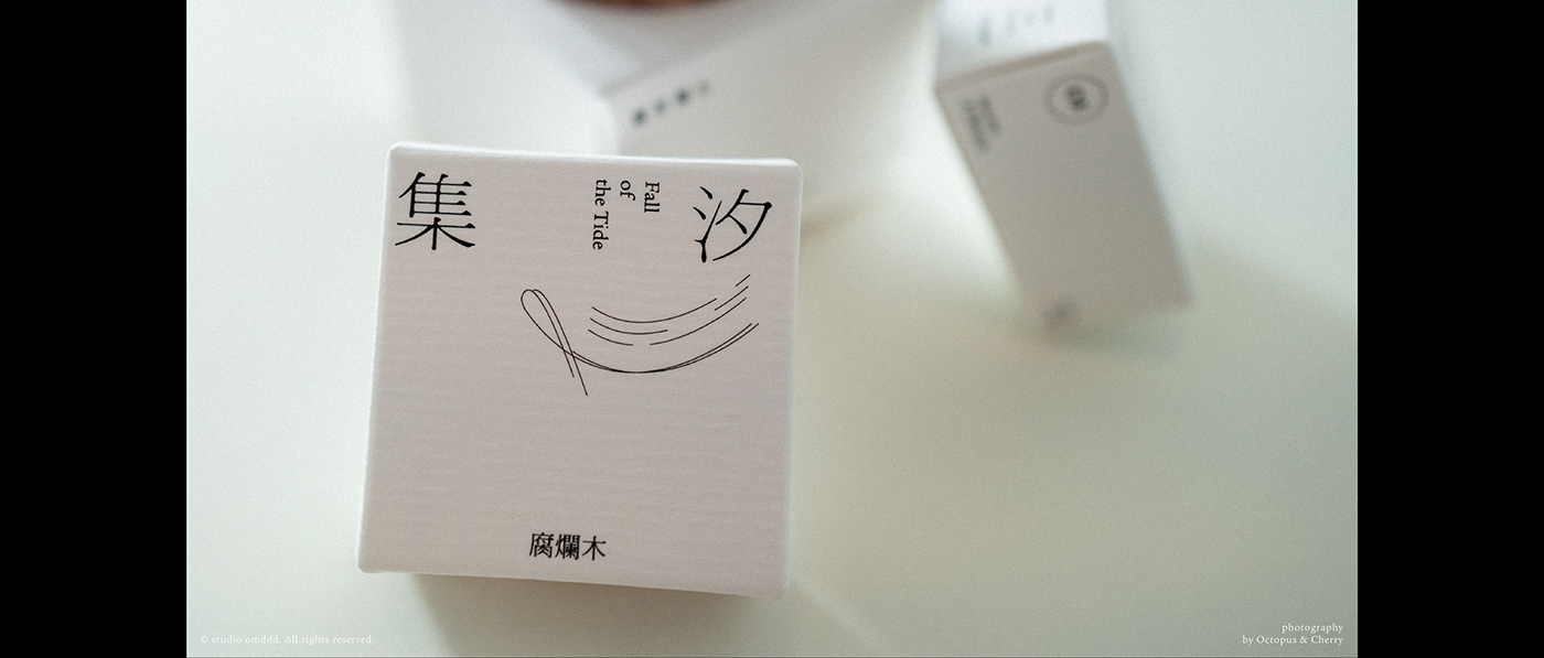
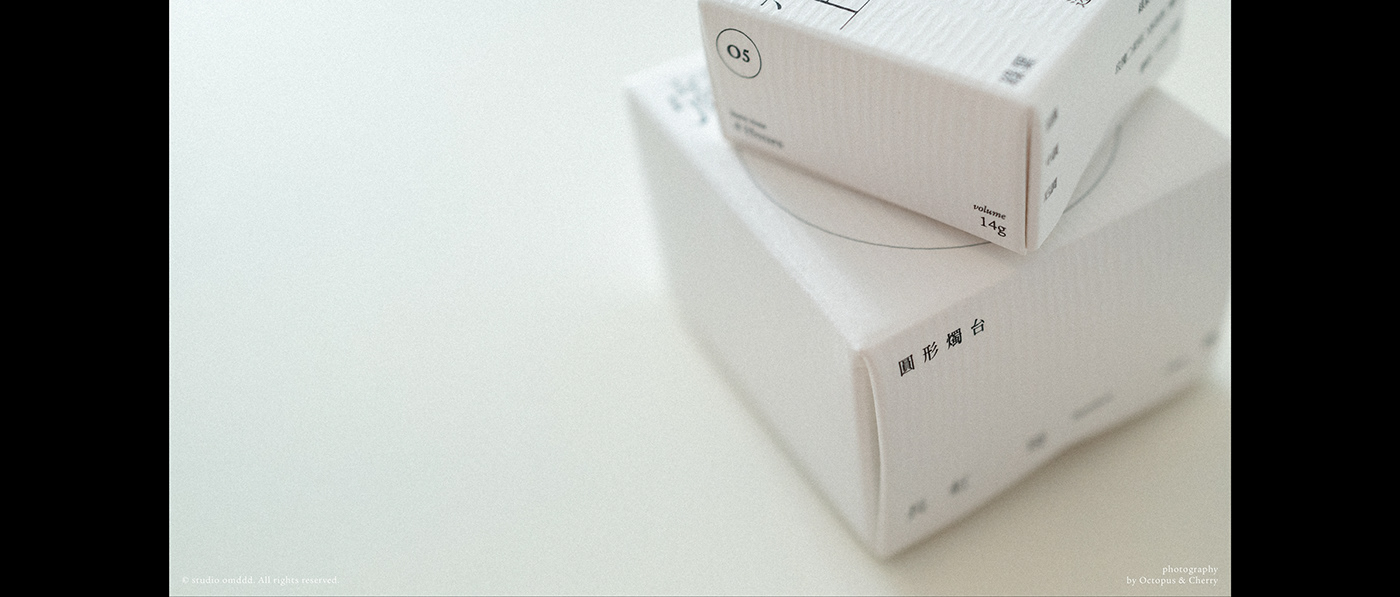
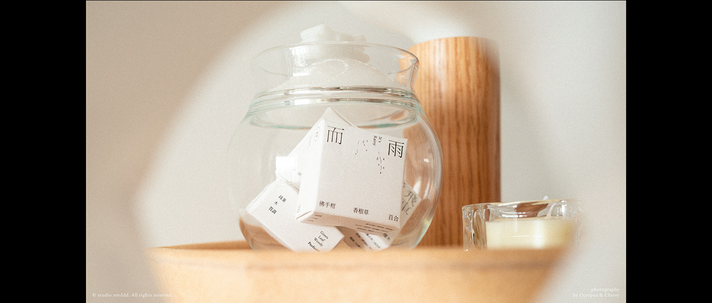
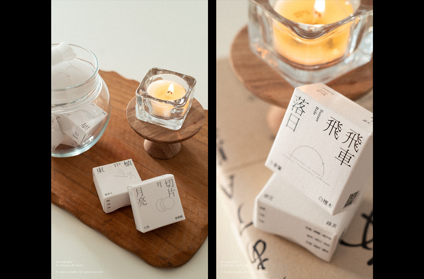
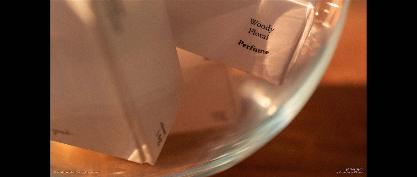
無態度——小眾香薰品牌,主理人想要用比較簡單直接的方式傳達香味的概念。『簡單但不落俗套』是我們常在客戶那裡聽到的詞語,可落實起來卻不是一件容易的事情。溝通中,發現客戶偏愛文藝展覽類視覺,藝文類的簡單視覺,其實只用文字以及線條表達即可,文字付諸的版面空間的基礎,而線條組成的圖案則是為視覺增添靈動的質地。
如何才能『不落俗套』?
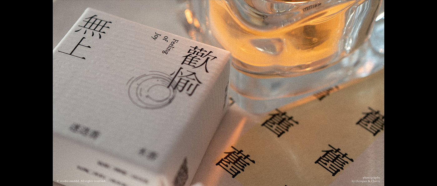
個人見解是盡可能不和現世代的流行所掛鉤,整體不是走『無襯線拉扁』和『色塊』的大趨勢流行,藝文類的命題我還是比較傾向襯線體的運用,去做字體小部分的設計,不需要重新設計原本的字體。 那回到這個問題,用襯線體就是『不落俗套』,無襯線就是流行就是俗套?我還真不知道,這或許是另外一個問題了吧。
No attitude - A niche aromatherapy brand, the owner wants to convey the concept of fragrance in a relatively simple and direct way. "Simple but unconventional" is a phrase we often hear from our customers, but it is not an easy thing to implement. In the communication, I found that customers prefer the visual style of art exhibition, and the simple visual style of art and literature can be expressed only by words and lines. The text is the basis of the layout space, and the pattern composed of lines is to add a clever texture to the vision.
How to be "unconventional"?
My personal opinion is as far as possible not linked to the popularity of the current generation, the overall is not to go "sans-serif pull flat" and "color block" of the general trend of popularity, I still prefer the use of serif to do a small part of the font design, there is no need to redesign the original font. So back to the question, with serif is "unconventional", sans serif is popular is conventional? I don't know. That's probably another question.
© 2O20-2O23 OCTOPUS_CHIEN. All rights reserved.